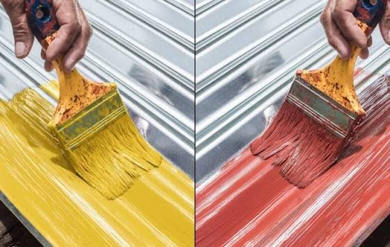
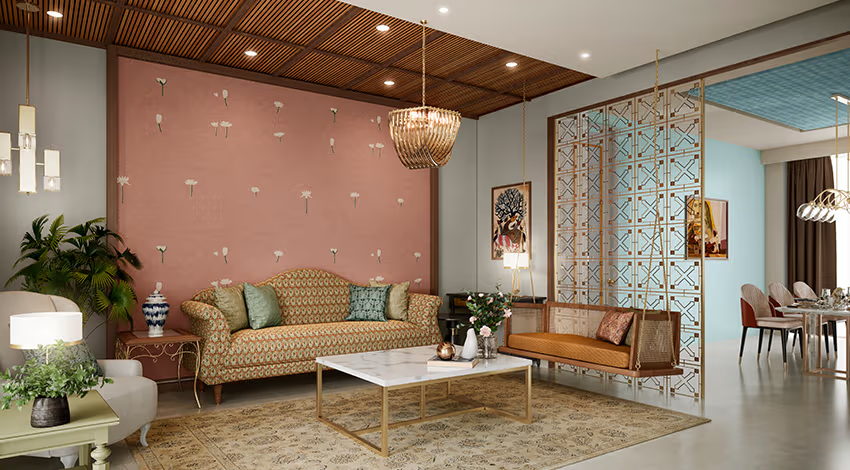
Standing in front of a wall of paint swatches, everything looks slightly different than you expected once it’s actually on your wall. Good paint color ideas account for lighting, room size, and how a color actually behaves at different times of day — not just how it looks under showroom lighting.
Understanding Natural Light Before Choosing Colors
Quick answer: Rooms with limited natural light generally look better with warmer, lighter tones like soft cream or pale yellow, while rooms with abundant sunlight can handle deeper, cooler colors like navy or forest green without feeling closed in.
Test any color on your actual wall at different times of day before committing — morning light and evening light change a color’s appearance more than most people expect.
Exterior Painting Is Different From Painting Indoors
Choosing Colors for Small Rooms
- Light, neutral tones make small rooms feel more spacious
- Avoid excessive contrast between walls and ceiling in tight spaces
- A single accent wall in a slightly bolder tone adds interest without overwhelming the room
Bold Colors for Larger, Open Spaces
Larger rooms and living areas can handle bolder paint color ideas — deep blues, terracotta, or forest greens — without feeling cramped the way a small bedroom might with the same shade.
Choosing Colors Based on Room Function
- Bedrooms: soft, calming tones like muted blues or gentle greens work well for rest
- Kitchens: warmer tones like soft yellow or terracotta suit high-energy cooking spaces
- Home offices: neutral or slightly cooler tones tend to support focus better than overly warm shades
The 60-30-10 Rule for Color Balance
A simple, effective rule: 60% dominant color (walls), 30% secondary color (furniture or accents), 10% accent color (decor pieces). Following this keeps a room’s color scheme from feeling chaotic or mismatched.
Testing Paint Colors Before Committing
Buy small sample pots and paint patches directly on the wall, not just on paper. Colors shift depending on the surface and surrounding light, so paper swatches alone can be genuinely misleading. [link to related guide on exterior house painting here]
Trending Paint Colors for 2026
Warm neutrals, sage greens, and muted terracottas continue to trend across Indian homes this year, moving away from the stark white walls that dominated for the past decade.
Matching Paint Color to Existing Furniture and Decor
Rather than choosing paint first and hoping furniture matches later, pull colors from existing pieces you already love — a rug, a favorite chair — and build the wall color around that instead.
FAQ
Q1: What paint colors work best for rooms with little natural light? Warmer, lighter tones like soft cream or pale yellow generally brighten rooms that lack strong natural light.
Q2: Should small rooms always use light paint colors? Generally yes, though a single darker accent wall can add character without making the whole room feel cramped.
Q3: How do I know if a paint color will look right in my room? Test sample patches directly on your wall at different times of day before committing to a full room of paint.
Q4: What’s the 60-30-10 rule in paint color selection? It’s a balance guideline: 60% dominant wall color, 30% secondary color from furniture, and 10% accent color from decor.
Q5: What paint colors are trending for homes in 2026? Warm neutrals, sage greens, and muted terracotta tones are trending, replacing the stark white walls popular in recent years.
Conclusion
Choosing paint color ideas doesn’t need to feel like guesswork if you factor in your room’s light, size, and function before picking a shade. Test on your actual walls, follow the 60-30-10 balance, and trust your instinct once you see it in your own space, not just on a swatch card.
Suggested Alt Text:
- “Paint color swatches being tested on living room wall”
- “Bedroom painted in calming muted blue tone”